Acerca de
Role: UX & UI designer
Tools: Ai & Xd
Timeline: 2016-2018
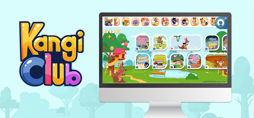
GAME PORTAL KANGI-CLUB
Project Overview
KANGI CLUB was created to teach children the English language through educational games and animated videos.
The KANGI CLUB website used to download learning materials that are adapted to all students personally.
The site contains 22 study programs with a wide range goal to offer unique content for each program.

A view of the old Kengi Club website
My role
To drive and lead the project from lean research through the UX process with the product manager to the creating the design line.
Research, UX design, prototyping, UI design
Team & Partners
-
Product manager
-
Head programmer
-
QA
-
Animators
-
UI designers/illustrators
Design Process
-
Defining the customer's goal & user experiences
-
Defining project challenges
-
Key Objectives
-
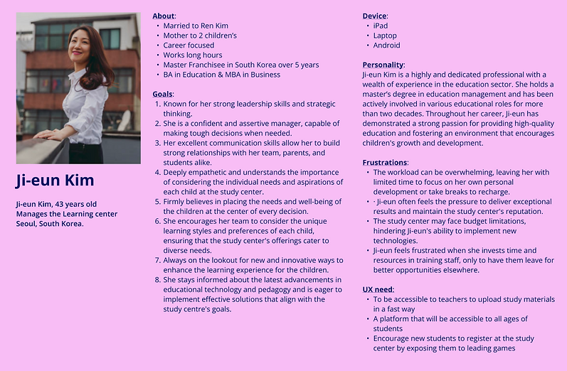
persona
-
Research Goals
-
Wireframe & UX Design
-
UI Design & Prototyping
-
Summary
Challenge
-
To encourage students to continue practicing the study of the English language that takes place in the study centers together with the teacher through games and songs at home as well.
-
Bringing new leads to the study centers through limited exposure to content
-
Strengthening the brand and marketing new educational content
Key Objective
-
To create a general shell for all the HD's programmers with an accessible, modern, and experiential interface to students.
-
Create new educational games based on existing educational content.
-
Learning a second language in an experiential way based on content taught in study centers to give students an additional tool for memorizing the material taught in study centers
-
Presenting a large range of study programs in fun way in a friendly interface for children 2-10 years old.
-
Creating a connection between the students and the characters by presenting the content in a correct visual way
-
Download visual load for easy navigation on the site
-
Cut down long texts, young children do not read the English language and in general young people don't read the work order
to the end. -
Connection to the STREAM website, an audio content website
-
The content is presented quickly to prevent the student from losing attention
-
The student/user's first experience with the website should be quick and positive
-
Creating a personal avatar for the student to the site
-
To adapt the marketing material to children
Persona

Research Goals
Children are free and love to discover new things as they grow up.
Children go online for entertainment. They see the computer as a gateway to fun and play.
As easy as it sounds, designing for children is much more difficult than you think, so you must adhere to the following rules:
-
Use bright colors
-
Use characters
-
Create depth in the design
-
Image based navigation
-
Low loading times
-
User interaction
-
Use video and games
-
Include printable elements
Competitor research results

-
Buttons large & bold
Buttons and interactive areas should be large and bold. This is true for all users and especially for children.
-
Minimize visual load
When we want to build an interface with complex backgrounds in terms of colors and graphic details to arouse curiosity and desire to explore. Use elements that remind the child of their natural environment, such as trees, houses, sky, grass, and domestic animals.
This will help him "feel at home" and connect him to the game or activity on the site. -
Clear hierarchy of content
When users don't know how to read, it's imperative to maintain a clear hierarchy of content and highlight elements. These elements should be enlarged, adding shadows, outlines, and arrows. Sound and animation are also excellent means of attracting attention, emphasis, and explanations. Especially, if you decide to use icons and symbols, note that what is obvious to us, is not always clear and understandable to children. -
Learning through a game experience
Children aged 6-10 learn to read. They will probably enjoy recognizing letters and words through play, rather than as required of them in school. Therefore, if you want to attract children to use the website or application, it is advisable to allow them to perform interactive actions. This includes drawing, watching videos, listening to music, and playing various stories and games. -
Payment options
Advanced payment options make sure that the process is not accessible to children during the game and that the parents understand what they are buying. The parents will want to make sure that the content is indeed suitable for their child, contributes to his development, and no less importantly, can keep him busy for a while. -
Child's point of view
Because this is an application from a child's point of view and very different from ours. It is highly recommended to test and check the reactions of the young target audience. At least convincing him to participate would be easy.
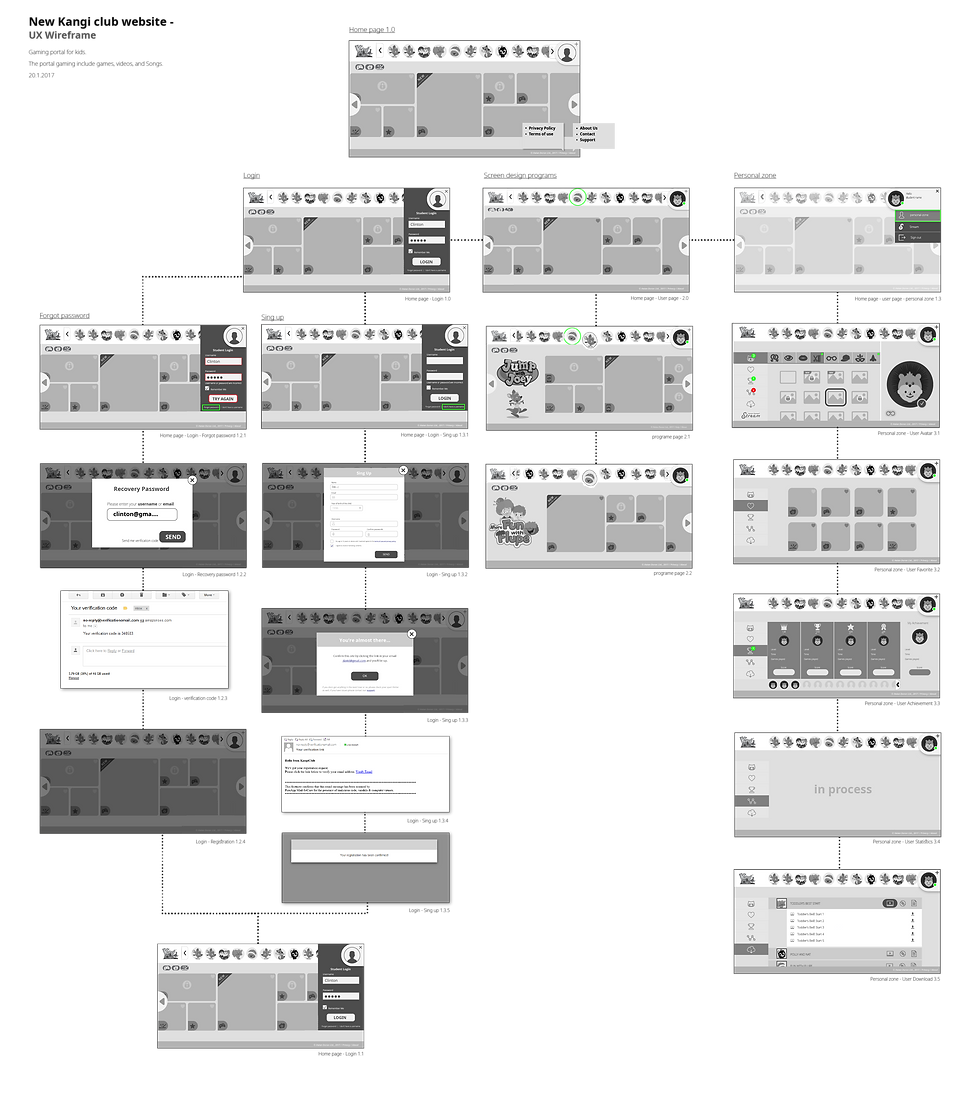
Wireframe & UX Design
The work process in the project is done fast that includes UX and UI at the same time.
This is due to a short schedule and limited budget.
The UX process was done jointly with the product manager. This was after receiving the results of a study we conducted regarding design processes for children in digital interfaces.

Kangi Club platform user flow
UI Design & Prototyping
As part of the design process, we developed a limited and balanced colour palette that blends well with the characters.
This is to create a balance between characters, images and buttons in the interface and reduce the visual load.
The design process was managed by me and including 2 illustrators + 3 freelance animators.
The goal was for everyone to maintain a uniform look & feel and adhere to the design definitions received at the beginning of the process.
The personal area includes:
-
Creating an avatar
-
Saving favorites
-
Achievement table
-
Results for students
-
Material downloads
Educational materials download screen - on this screen, the programs the student is register, it will appear, and he can download the materials and contents for him:
-
Music files
-
Videos
-
Work files for practice


Summary
The Doron project was long, complex, and involved quite a few actions through which I got to learn the behaviors of young users; children aged 2-10.
Sharing management processes, times, constraints within a cohesive and professional team that, thanks to good work, achieved the material goals we aimed for:
-
We presented the characters of each study program in the upper navigation bar to cause the student to quickly identify and connect with his favorite character.
-
Due to many programs, we built the bar as a dynamic carousel.
-
we have included content that is open for free. However, most of the content is locked to students and can only be accessed by registration.
-
Building a design language - due to children's attraction to colorful colors, we defined a very limited color palette that blends with the characters. And this is to create a balance between the characters, the images, and the interface buttons.
-
Setting up a personal area that can be accessed by entering a password and a username only in study centers. Individual students can create their personal avatar and link to the STREAM website.